Advanced Search

Search in date range:

Search results:

Found 22 entries in 0.075 seconds.

General Twitter 2016 ()
#1 Copy

Argent

17th Shard user Treamayne made an interesting observation re: Surge glyphs - Can you comment? :3

Isaac Stewart

No comment yet on this specifically, tho I'll respond to something in that thread regarding names and "screw yous" within glyphs.

Isaac Stewart

Readers are trying to pronounce glyphs by reading them. Glyphs aren't read. They're memorized. Sounds might be found in glyphs.

Isaac Stewart

Glyphs have evolved from the early days. Just like the Chinese character for "tree" doesn't look like a tree anymore.

Isaac Stewart

Alethi glyphs are recognized by overall shape, not by the shapes/sounds that might be found within.

Isaac Stewart

For example, the Bridge 4 glyph is still recognizable even if the component shapes are changed.

Isaac Stewart

Hope this helps!

Argent

So let's see if I got it. The "kholin" glyphpair could, given enough time, no longer look like "khokh" & "linil"...

Argent

... but still be recognizable as "kholin" due to its overall shape?

Isaac Stewart

That is correct. More ancient glyphs will have slowly morphed away from the original sounds found inside.

JordanCon 2018 ()
#2 Copy

Isaac Stewart (paraphrased)

The stamp-like glyph at the bottom corner of the "Ironstance Scroll" artwork in Words of Radiance is the symbol of the Calligrapher's Guild. It uses the phonemes from "Isaac", but doesn't phonetically represent that.

Jofwu (paraphrased)

I thanked Isaac for explaining that rather mysterious glyph, and asked if he could say anything about the even more mysterious glyph that has appeared in every book so far.

Isaac Stewart (paraphrased)

I don't know what it means, but that Brandon has asked me to put it in several places. Compare it to the Calligrapher's Guild glyph. "That's all I'll say."

Dragonsteel 2022 ()
#3 Copy

spectria.limina (paraphrased)

On the broadsheets distributed at the con, there's this glyph in the bottom right corner of the map. But in [The Lost Metal] there's writing instead of the glyph.

Isaac Stewart (paraphrased)

Oh yeah, I used to sign my art, but I felt it didn't fit in-universe, so I started using that glyph instead, then eventually I stopped doing that. It doesn't mean anything.

General Twitter 2014 ()
#4 Copy

Argent

Can either one of you, pretty please, tell us if Alethi was inspired by the Elian Script?

Peter Ahlstrom

It was not. The inspiration for the shapes was an EKG readout.

Brandon Sanderson

He might be speaking of the Thaylen script, which looks more like the Elian script than Alethi does.

Argent

Right. I was thinking Alethi glyphpairs, which seem to share some ideas with Thaylen letters.

Brandon Sanderson

The glyphpairs are more Chinese influenced. But Isaac will have to answer on Thaylen.

Isaac Stewart

Late to this conversation (forgot password!) Similarities to any Earth scripts is coincidental.

Argent

I was thinking more conceptually, less visually. Just trying to crack the writing system :)

Isaac Stewart

Thaylen and Alethi are related kinda in the same way Korean hanja and Chinese chars are related.

Peter Ahlstrom

Do you mean hangul? Since hanja and Chinese characters are pretty much the same thing.

Isaac Stewart

I defer to Peter on this one. :) And add a small RAFO, which looks a lot like 'rafo.'

JordanCon 2018 ()
#5 Copy

Isaac Stewart

I think they might have [the Highprince glyphs] in order on the warcamps map, when I have them on the edge. They might be in order, but I might have put them together in a way that they just looks nice... I think I might have picked an order that looked cool. I'm like, "Ah, this one looks better here and moved them around."

Pagerunner

One of them's upside down, right?

Isaac Stewart

I think they go all into a symbol in the middle... You might have some of them upside down. I'll have to look at my old file that has the originals. And you can see, too, that their glyphs, they're starting to look different from what I do now stylistically.

Pagerunner

You talked about the Shard line, and I've seen that, they all have this line down the middle.

Isaac Stewart

Yeah, we started changing things. That's just how things work. Things evolve. But, it works in the history. There was probably a time when the calligraphy, it was just in the vogue to do it this way. The rules could have changed. If you're the Calligrapher's Guild, you're gonna want to change the style, see what's in vogue. Because, hey, now all the nobles need to change their house logos so their logos, their glyphs don't look... "Oh, that looks so old." They want to stay relevant, so they probably do things like that. It's interesting how that-- Even though there's a kind of way they look like mistakes, it's how things work in the real world, people make slight changes and people do things a slightly different way, but I imagine those particular glyphs are a little more simplified than some of the stuff that we're doing. If we were to go into, like, Sadeas's glyph, for example, it's really simple. But I have other places where it's got more lines and stuff. His personal banner is probably gonna have more stuff in it.

Pagerunner

One of the Kholin glyphs has all these extra letters. It's like, "Wait a minute, what are these letters?"

Isaac Stewart

People call them "screw with you" lines. No, they call them "screw you lines," and it was never meant to mess with people. It was meant to make it look cool.

Words of Radiance Omaha signing ()
#6 Copy

Questioner

So do you come up with those [glyph designs] or is there an Artist that does that?

Brandon Sanderson

You know what?  All of those have been done by Isaac.  I came up with a sequence of them for the original right in 2002.  And they just weren't up to my current artistic standards, and so I let Isaac do it.  I'm a big believer in letting people who are experts in things do what they're good at doing, to the point that when I needed a creepy lullaby in this I hired a musician to write it rather than writing it myself just so that we would have  the extra *inaudible*.  

Questioner

Is that the?

Brandon Sanderson

The backstory one.

Shire Post Mint Mistborn Coin AMA ()
#8 Copy

Argent

  • In analyzing the glyphs we've seen in the books, we've noticed that some of their "components" resemble the Thaylen symbols for consonants. The Thaylen don't have letters for vowels though - does that mean that glyphs also disregard vowels 100% of the time, or do vowels affect the way a glyph is written? For example, would "viv" and "vev" look exactly the same, or would there be some differences?
    • If vowels do affect the glyphs, do they affect them by somehow changing the consonant lines?
  • Our best theory for deciphering new glyphs is that the glyph "letters" actually correspond to two English letters - so writing "vev" is more akin to writing <ve> followed by <v_> (or perhaps <_v> followed by <ev>). How much of this is in the right direction?

Isaac Stewart

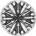
Good questions! The vowels don't affect the glyphs any more than the consonants do. I'm going to RAFO about the glyphs relationship with Thaylen. You're on the right track, however, on half of the word being written and then mirrored. That said, please remember that glyphs aren't meant to be read or even deciphered. They're learned in the same way that we can look at dozens of stylized pictures of cats and still be able to tell that it's a cat.

Argent

So, you've said that glyphs are not meant to be read several times, and I know that, but I think I've been misunderstanding you. I've been assuming they are just too complex and decorated - like an extravagant font. Are you saying they are not a hard writing system instead?

There are obviously some rules to how the glyphs are designed, but does your reply mean that there is always a little bit of "I'll do what looks cool"? Kind of like how the band Koяn decided to flip the "R" - it's still recognizable enough, but there's no rule that says when you can and can't do that?

Isaac Stewart

Let's see if I can explain further. Glyphs are recognized rather than read. If you learn the letters in an alphabet and you come upon an unfamiliar word, you can be reasonably certain you'll know how to pronounce it if you're already fluent in the language. You can at least read it, and you might know from context what it means. Glyphs are different in that if you come upon an unfamiliar glyph you might be able to guess what it means by its shape, but until someone tells you "that glyph means 'soup'" then you're still guessing.

The calligrapher's guild has rules they follow in creating glyphs, and there's a lot of artistic license, like the flipped R in Koяn, for the very reason that the guild isn't expecting people to read the glyphs. Those in the guild--and some scholars who are interested in how glyphs morph over time--might be able to decipher some of the glyphs for academic purposes.

How's that? Any clearer?

Argent

It is clearer, yes :( I think we might still bug you every now and then, but I am coming to terms with the idea that we won't get anywhere near the level of understanding we have for the women's script, for example. It just felt so close, with the slight similarities between some glyph components and the Thaylen letters, you know?

Isaac Stewart

There's definitely a relationship between the Thaylen letters and some of the glyph components (although it's not the biggest part of what makes up the glyphs). Imagine if back in the middle ages a culture decided to use some latin letters as the basis for symbols so that it would be easy to mark things for people who don't read. This hypothetical culture threw in a smattering of other alphabets in there too. So, if that sort of thing developed naturally over time with phonemes and symbols getting added as the culture encountered other cultures, then you might get a bit of an idea of what's going on with the glyphs.

ccstat

I admit I'm still a little confused. The glyphs are recognized based on their shapes, but those shapes also appear to be highly mutable. I'm not sure how to reconcile those two ideas.

If an established glyph can be stylized into a crown, a skyeel, or the other shapes that highprinces use as their symbols, how does someone associate the new shape with the standard one with which they are familiar? Does the stylized version preserve some core recognizable shape (since the constituent graphemes alone wouldn't be enough to decipher the meaning)? Or does each instance of a glyph have to be learned separately?

Isaac Stewart

I agree that those two ideas are hard to reconcile! Let me see if I can explain it a bit more without giving too much away.

There's a calligrapher's guild that creates (and I suspect controls to a certain extent) the official glyphs. If a new glyph needs to be made, they do it in a way they see is proper, based on canonized rules that have developed over time.

That doesn't keep amateur glyphmakers from creating things from time to time, and there's certainly a shift in shape as glyphs morph through the ages. The Guild is probably a lot like the Oxford English Dictionary folks, occasionally canonizing popular but unauthorized glyphs that get used so much that they become ubiquitous.

Usually it's just guild members who are morphing glyphs into poems and such. If a nobleperson wants a glyph for their house, they go to someone authorized by the guild, and they'll stylize things into a crown, a hammer, etc. A good example of this will be seen in one of the pieces of art in the new book. We've seen Dalinar's Tower and Crown. Watch for the Sword and Crown and compare the shapes inside the Sword with the shapes inside the Tower. Maybe that will help with some understanding.

/r/books AMA 2015 ()
#9 Copy

Argent

Are the glyphs on The Way of Kings front sheet the Alethi glyphs for the Radiant orders and the Surges? If so, can you tell us the name (i.e. the pronunciation) of the Windrunners glyph? Or, if you don't have this one, maybe another one?

Brandon Sanderson

Yes. I'll see if we can get all of the pronunciations into the appendix of the third book.

Words of Radiance Chicago signing ()
#12 Copy

Argent

In The Stormlight Archive there have been multiple writing systems, [which] as a part of a community effort we've translated, for the most part, the Alethi [Vorin women's script], the Thaylen. Can you talk about the technical details of the glyphs writing system?

Brandon Sanderson

The glyphs were designed by Isaac Steward. He is my scribe, artist, and cartographer. He is also the art director at my company. We sat down and I wanted something symmetrical, so actually half of the glyph is repeated. When you read into it, it's symmetrical, and you can read them by the points where they slant, but you will have to go talk to him about exactly how to do it, because I say "I want a glyph for this" and he designs it. So they are readable, but-- The thing that I used as a model is, I got Arabic art; if you guys haven't read Arabic word art it's gorgeous, it's really cool. And sometimes when it gets really distorted you have to know already what it says, and that's how some of the glyphs are.

Shire Post Mint Mistborn Coin AMA ()
#13 Copy

Jazzy-Kandra

I've noticed that the glyphs seemed to take inspiration from Arabic word art and calligraphy... Do you think you could talk a little more about how it inspired the making of glyphs and the art behind them? Did you draw from any other written languages (like Chinese calligraphy) when creating this system?

Isaac Stewart

Good question! The biggest influence was definitely Arabic word art and calligraphy. That's something Brandon and I wanted to do from the start with the glyphs, and I realized that in order to make both glyphs and word art work, I'd have to take things a step farther and figure out the building blocks of the glyphs. I can't think of any other systems off the top of my head that I drew direct inspiration from.

The second biggest influence was the need for the glyphs to be symmetrical to reflect the holiness of symmetry within Vorin culture. I had an old iPod touch (it was new back then) and a simple symmetry app. When I found myself with a few minutes, I'd spend time sketching interesting shapes. I saved the best of these for use in The Way of Kings. Using those as a base, I started coming up with calligraphic shapes that would allow me the look I wanted, and over a bit of time, I developed a lexicon of shapes to use in the creation of glyphs. This helped keep the style mostly consistent from one glyph to another. Though there are levels of complexity in glyphs, I believe--everything from creating a glyphward for religious purposes to scrawling the shorthand version of a glyph on a map to indicate whose army is where.

Shire Post Mint Mistborn Coin AMA ()
#14 Copy

Oudeis

Huh. I had always assumed the glyphs were more like the syllables in Japanese, where the symbols don't contain any of the phoneme information, directly.

Isaac Stewart

You are mostly correct. The glyphs are meant to be recognized rather than read. However, some phonemes do show up in some of the glyphs.

Oudeis

Kaladin just picked up a listener knife and noticed glyphs on it he didn't recognize.

Now, he can read glyphs, but he's not much of a scholar.

Are these glyphs even in the same linguistic family? Is Kaladin fluent enough with glyphs that he'd recognize if they were, to use an analogy, Korean symbols instead of Japanese symbols?

Isaac Stewart

The shape of the glyph matters more than the phonemes that make up the glyph. Over time, glyphs morph toward what's easier to write as people who know nothing of the internal phonemes take shortcuts, etc, so a hypothetical Kaladin who can suddenly read the phonemes inside glyphs would only be able to decipher the newer ones that haven't had a chance to morph over time. So, hypothetically speaking, Kaladin would be able to recognize glyphs no matter the symbols that make them up. The arrow-looking glyph from the forehead tattoos is also found in the Bridge 4 glyphpair. Both glyphs mean "bridge" even though the internal pieces of each are quite different. It's like us being able to recognize the letter R whether it's in Times New Roman font or in a wildly different font like Desire (https://www.myfonts.com/fonts/charlesborges/desire/). Hope this helps!

Oudeis

It does, yes! I figured it wasn't the phoneme meta-data.

Basically my question was, Kaladin looks at the glyphs on the listener daggers, whose providence we still don't really know, and seems to assume that although he doesn't know these specific ones, they are "glyphs" as he knows them. I don't speak too many European languages, but if I saw a series of words I suspect I'd have reasonable success sorting out which ones are Polish and which ones are not, just from knowing which letters tend to be common and what patterns tend to be prevalent.

So my question was simply... is Kaladin fluent enough that we can assume he's right, these symbols actually are glyphs in the manner he knows them, just ones he doesn't recognize? (Or the equivalent of very odd spellings?)

Or is he simply making an assumption; he knows what a glyph is, so if he sees something similar he just assumes it's a glyph, when it isn't anything close? We see the Alethi, even the bridgemen, do that a lot to the listeners, just being ethnocentric, judging the listeners by Alethi standards, assuming that Alethi culture is the basic standard and everyone else is a deviation from that.

Anyway, thank you for the answer!

Isaac Stewart

Sorry that I misunderstood your question. Now I see that you're referring to a specific spot in The Way of Kings. I just re-read the section you mentioned to re-familiarize myself with it. The glyphs he sees on the knife look different enough from the ones he knows to make him question their origin. It's not clear enough to me from the text to say definitively that the knife is of Alethi or Listener origin or from somewhere else altogether. (I suspect, though, that the knife is not Alethi in origin.) Kaladin is likely making an assumption--as you mention--that what he sees are glyphs. In the very least, they're symbols of some sort. Whether glyphs or letters in an unknown alphabet is up for speculation.

JordanCon 2014 ()
#15 Copy

Isaac Stewart

The glyphs don't really relate to pronunciation. You learn them by seeing the glyph and knowing what the word is for that. But the people, the people who create the glyphs have a different process from ones who read them.

Questioner

*inaudible*

Isaac Stewart

It can be pretty challenging to draw the glyphs. We usually go through several different iterations of different looks of things before we come up with something that we like.

Oathbringer Portland signing ()
#16 Copy

Questioner

Glyphpairs, or glyphs, for the specific Surges. Are they supposed to be slightly different? Or are they perfectly symmetrical?

Brandon Sanderson

It depends on who paints them and how. Most of them are supposed to be symmetrical.

Questioner

Because I got the Progression tattoo, and my tattoo artist noticed that it was slightly different on both sides, where there was a curve instead of having a square. And he said, is it not supposed to be perfectly squared off? Because then it would be--

Brandon Sanderson

Some people draw them that way, depends on what they're writing, and things like that. So, I would ask Isaac. Write an email to [email protected] and ask him about it, because he designs all those. I just give him general directions, he's the one that can actually write them.

JordanCon 2014 ()
#17 Copy

Questioner

Did Ben or Isaac design the glyphs in The Stormlight Archive?

Isaac Stewart

I did. So here's an interesting thing the-- no I'm not going to tell you that. *lots of laughter* I think it would be a spoiler for Book 3. Bridge Four in Alethi, you guys ready? Vev Gesheh. Vev is the number four, Gesheh is bridge... When I design the glyphs, I always make sure I know how to say it in Alethi before I design the glyph.

Ben McSweeney

Is there a reason for that?

Isaac Stewart

There is a reason for that.

Ben McSweeney

Are you going to tell us what that reason is?

Isaac Stewart

Nope. The glyph writing system is just a-- You are supposed to be able to look at it and say "Hey that's--that means bridge" but it could be elongated, it could be changed, it could be--but the same shapes are in there and that means "bridge" or whatever else that is.

Shire Post Mint Mistborn Coin AMA ()
#18 Copy

Argent

How long did it take you to come up with this writing system? :)

Isaac Stewart

It took several weeks if not months at the end of 2009 and the beginning of 2010 to nail down the basics of the glyph system. There was a lot of back and forth with Brandon at first as we both felt out what we wanted to do with it. In some ways, I feel like we're still filling in some of the blanks as we go, so it's an ongoing process.

YouTube Livestream 13 ()
#19 Copy

Extremepayne

Are the shash glyph on Kal's forehead that means "dangerous" and the shash glyph for the Lightweavers related? If so, how?

Isaac Stewart

I don't believe that they're related. I think these are words like, in English, where we have "to," "too," and "two." There is also, I think, a shash somewhere else in one of the other books; it might have been Warbreaker. And it's just a recurring sound.

With the two glyphs, they're not related. They're as related as the words "too" and "two" are.

Interview with Isaac Stewart ()
#20 Copy

Trevor Green

On a similar note, The Way of Kings has a lot of symbols associated with different aspects of the book. Were you involved with creating those, and if so, how did you design them?

Isaac Stewart

I created forty-plus symbols for The Way of Kings. Many of these are found in the color charts in the hardcover version of the book (link here). My absolute favorites are used at the beginning of each Part (one of them is debossed on the book's hardcase beneath the dust jacket). I used Arabic word art and the shard blades as inspiration for these. Many of the originals were drawn on an iPod Touch and later brought into Photoshop for clean up.