Found 3 entries in 0.029 seconds.
i_do_stuff
Do the Allomantic and Feruchemic symbols for the metals have any extra meaning to them? More specifically, were they given those symbols on Scadrial for a reason?
Brandon Sanderson
As for the symbols, they go WAY back to before the Lord Ruler's ascension. So perhaps, perhaps not. (On other words, RAFO.) :)
EHyde
I was also wondering, with the Steel Alphabet in the Mistborn books, each of the letters aesthetically looks like it's built from a cuff, a spike, and a bead, and was that intentional to reflect the magic systems?
Brandon Sanderson
Yes. Do remember that that writing system was developed by the Final Empire. They actually took the ancient Terris symbols and they made them more to their own aesthetic over time.
Pagerunner
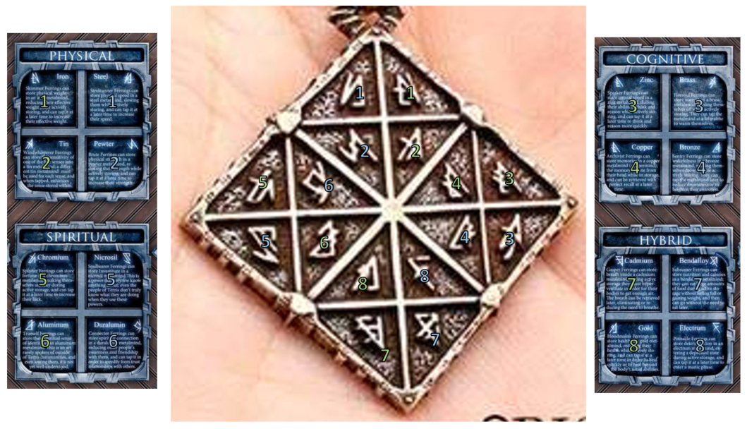
I just saw the Feruchemical Table medallion on the store, and it reminded me of a question that was raised on the forums a little while back. It appears there's a mistake in the metal pattern, with regards to pure metals and alloys; Chromium and nicrosil are in the opposite places from what we'd expect. I've attached a color-coded example; with pure metals in green, and alloys in blue, it's evident that the Spiritual quadrant has them criss-cross, unlike the other quadrants. The medallion matches the poster's layout; that's where the question originally arose, from the poster. Is there a reason for this switch? Or is it an error in the pattern?
Isaac Stewart
I just looked over the chart, and rather than the metals being in the wrong places, it looks like I accidentally swapped the symbols. So the medallion is correct. It's the symbols for chromium and nicrosil that ought to be swapped. I've cc'd Peter on this email, too, so he's aware of the mistake. I'll try to remedy this for future printings.